TO DRAW OR NOT TO DRAW
Finding our way to another city is not a very difficult task these days. Using GPS, we easily travel from one place to another. We know how to read the map that is shown on the screen of our phone. We distinguish different kind of roads and there may even be a variety of symbols telling us where to find certain landmarks, restaurants, gas stations and so on. After a while, we arrive at our destination.
The navigational map we used during the trip gave us a picture of the world around us. If it showed all the possible details and if it was on a 1:1 scale, we would not have any use for it. The same goes for maps that are not digital. Because of the specific purpose and different scale, the mapmaker has to make choices what to include and what not to include. This makes clear that a map does not show us geographical facts. Instead, a map is a construct, a document made by a human who has his or her own view on the surroundings. Potentially, a map could tell us more about its maker's view of the world.
PORTOLAN CHARTS
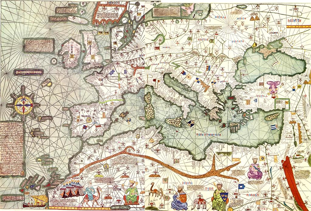
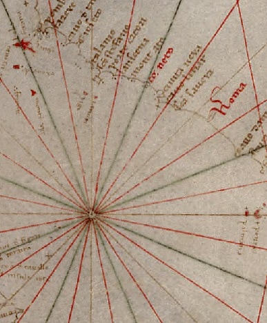
To navigate the Mediterranean Sea in medieval times, the captain of a ship used a so-called portolano, literally meaning 'port book'. These books contained directions and distances between ports, based on knowledge of experienced navigators. During the 13th century, the information in those portolans may have been used in the production of nautical maps known as portolan charts. Then again, the origin of the portolan charts is still unknown and highly disputed. The function of the charts is a less controversial subject. Some portolan charts are believed to be used at sea, while other charts were highly decorated maps, meant as gifts and objects of prestige. The picture below shows a portolan chart. At first sight, the chart might look confusing. Most of the compass roses have 32 lines: 8 brown lines for the main wind directions, 8 green lines halving the main wind directions and 16 red lines in between the brown and green. The names of ports are written perpendicular to the coast line, the most important ones in red.
Finding our way to another city is not a very difficult task these days. Using GPS, we easily travel from one place to another. We know how to read the map that is shown on the screen of our phone. We distinguish different kind of roads and there may even be a variety of symbols telling us where to find certain landmarks, restaurants, gas stations and so on. After a while, we arrive at our destination.
The navigational map we used during the trip gave us a picture of the world around us. If it showed all the possible details and if it was on a 1:1 scale, we would not have any use for it. The same goes for maps that are not digital. Because of the specific purpose and different scale, the mapmaker has to make choices what to include and what not to include. This makes clear that a map does not show us geographical facts. Instead, a map is a construct, a document made by a human who has his or her own view on the surroundings. Potentially, a map could tell us more about its maker's view of the world.
PORTOLAN CHARTS
To navigate the Mediterranean Sea in medieval times, the captain of a ship used a so-called portolano, literally meaning 'port book'. These books contained directions and distances between ports, based on knowledge of experienced navigators. During the 13th century, the information in those portolans may have been used in the production of nautical maps known as portolan charts. Then again, the origin of the portolan charts is still unknown and highly disputed. The function of the charts is a less controversial subject. Some portolan charts are believed to be used at sea, while other charts were highly decorated maps, meant as gifts and objects of prestige. The picture below shows a portolan chart. At first sight, the chart might look confusing. Most of the compass roses have 32 lines: 8 brown lines for the main wind directions, 8 green lines halving the main wind directions and 16 red lines in between the brown and green. The names of ports are written perpendicular to the coast line, the most important ones in red.

Figure 1: Late 14th century portolan chart, probably made in Genoa - Library of Congress
CULTURAL EXCHANGE
The expansion of trade in the Mediterranean Sea and the Black Sea did not only meant an increase of the exchange of goods. Contact between people from different parts of the Mediterranean world also led to cultural exchange. There is a role for portolan charts in showing how this exchange took place. Until recently, cross-cultural transfer of knowledge was mostly studied by using texts as sources, rather than visual sources like portolan charts. In visualising the world, the medieval cartographers used signs and visual language that originated from different cultures. Traditionally, the Mediterranean is divided into three cultural blocks: a Christian, a Jewish and an Islamic block. The cultural exchange is shown in the development of the depictions that are present on so many portolan charts. The boundaries between those aforementioned blocks were not as impermeable as sometimes is suggested. In this article, I will aim to explain how the centres of production of portolan charts were involved in cultural exchange between different late medieval Mediterranean cultures. To explain this I will make use of a method that is loosely based on Social Network Analysis.
Social Network Analysis is a method to map interaction between different 'nodes' in a network. These nodes are connected by ties. These ties can vary strength. Also, the nature and contents of those ties can be different. In this case, the centres of production of portolan charts act as centres of cultural exchange. Along the ties between those centres flows knowledge. As I said before, a map is not treated as if it provides us with geographical facts. It rather informs us of which choices the mapmaker made. Those choices were made on the basis of available knowledge, thereby maps could reveal what knowledge was exchanged. Thus, analysis of the visual language is crucial when we want an answer on the question of the involvement of production centres in cultural exchange. As the saying goes, a picture is worth a thousand words. The point is, what do those thousand words tell us?
USE AND DEVELOPMENT
In a world where maritime trade became more important, portolan charts helped facilitate the connections between medieval merchants. Some charts were part of the navigational equipment used on ships. Others were made specifically as gifts for people of high standing, or they were in the possession of merchants wanting to show their geographical and cultural knowledge. In a way, the charts spread cultural awareness amongst its owners. The production of charts was a matter of supply and demand. The buyer had to decide what to use it for. Nonetheless, to produce charts, cartographers still needed their creativity and the access to sources from different regions. The production of portolan charts was a practice that developed throughout the Late Middle Ages.
From the 13th century to 1440, three phases can be discerned in the development of portolan charts. The first phase is that of the early, fragmented charts. These emerged in northern and middle Italy. This phase ends in 1311. In the second phase, from 1311 to 1373, the development and spreading of the visual language took flight. It is very likely the mapmakers began to use catalogues of prototypes of signs. For example, the Campanile of Venice (a bell tower) on the charts by the Venetian Pizzigano family are all identical. Around 1375 the third phase started. Three cartographic schools were established, all with their own visual language: one in Venice, one in Genoa and one in Mallorca. On the basis of this phase model, one could see the emergence and transformation of a network of knowledge.
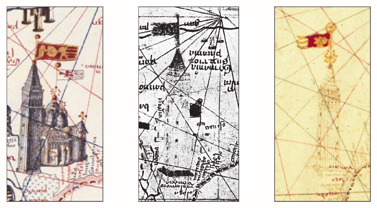
Figure 2: Campanile of Venice on different charts by the Venetian Pizzigano family
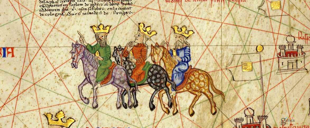
Mapmakers needed access to sources if they wanted to draw a map. An example of a mapmaker who was clearly going past cultural boundaries is the Mallorcan Jew Abraham Cresques (1325-1387). His most famous work is known as the Catalan Atlas, consisting of several panels of vellum on wood. The chart stretches from Europe to the Far East. He must have had access to information about the Islamic world and the Far East, because several texts and illustrations refer to the travels of Marco Polo. The panels with the map on it are preceded by panels with text, diagrams and tables. The use of both Roman and Arab-Indian numerals in these diagrams and tables is another example of cultural exchange.
CONCLUSION
In their visual speech, portolan charts reflect the knowledge of the world as it was perceived by the mapmakers of the time. The charts enabled merchants to navigate the Mediterranean Sea and gave men of higher standing an opportunity to show their knowledge about the world. Despite religious and cultural conflicts, the development of the visual language shows a connected medieval Mediterranean world.
S.M.
REFERENCES
Billion, Philipp. Graphische Zeichen auf mittelalterlichen Portolankarten: Ursprünge, Produktion und Rezeption bis 1440. Marburg: Tectum, 2011.
--, "How did medieval cartographers work?: New insights through a systematic analysis of the visual language of medieval portolan charts up to 1439." Cartes et géomatique, 216 (June, 2013): 33-45.
Brentjes, Sonja. "Fourteenth-Century Portolan Charts. Challenges to our Understanding of Cross-Cultural Relationships in the Mediterranean and Black Sea Regions and of (Knowledge?) Practices of Chart-Makers." Journal of Transcultural Medieval Studies 2, no. 1 (October 2015): 79-122.
Edson, Evelyn. Mapping Time and Space: How Medieval Mapmakers viewed their World. London: British Library, 1997.
Pujades i Bataller, Ramon J. Les cartes portolanes: la reprecentació medieval d'una mar solcada. Barcelona: Institut Cartogràfic de Catalunya, 2007.
IMAGES
Header: https://en.wikipedia.org/wiki/Abraham_Cresques#/media/File:Europe_Mediterranean_Catalan_Atlas.jpeg (26-5-2017)
Figure 1: https://en.wikipedia.org/wiki/Portolan_chart#/media/File:Mediterranean_chart_fourteenth_century2.jpg
Figure 2: Billion, Philipp. "How did medieval cartographers work?: New insights through a systematic analysis of the visual language of medieval portolan charts up to 1439." Cartes et géomatique, 216 (June, 2013): 42.
Gallery, 4: Detail of Catalan Atlas by Abraham Cresques. The three wise men.
https://1.bp.blogspot.com/-JjS0p_S4Tss/Usl5bb3Q0TI/AAAAAAAAo24/3u_ONBORF2Q/s1600/1375.Cresques.16.JPG